I’ve been blogging for over two years now and growing traffic, authority and readership slow and steady. Along with the steady increase in traffic the site has continued to increase it’s Adsense revenue at a similar pace with no sudden increases regardless of all the changes and adjustments I’ve made. That was true until I took the time to study many different published Adsense approaches. As I read all of these different approaches three distinct ideas came to the forefront.
Three Important Adsense Approaches
- Less is More – This concept is really simple yet I hadn’t really given it much thought before. First off the top ad is the highest paying ad and you want that in the best possible position.
- Size Matters – If you read enough Adsense guides you’ll find that the 336 x 280 Large Rectangle is the most effective Adsense unit. It typically offers four ads and they are likely to be very related to the topic based on the position between the post title and body.
- Position, Position, Position – Placing your Adsense unit above the fold is imperative for success. This makes sense to me for one reason. Every day my site (and I assume most sites) gets a majority of it’s traffic from search engines. This traffic is generated from people searching for something. So when they land on my page and they decide that it’s not the content they were looking for then I want them to see the Adsense unit right where they land so that becomes an “outclick” option.
How I Doubled My Adsense Revenue
In order to understand the approach I used to double my Adsense revenue I’ll use two graphics that show the same post before the changes and after the changes. First – the before shot: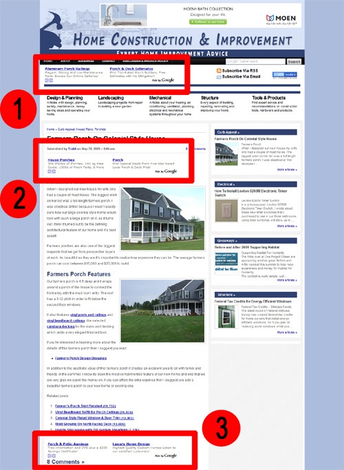
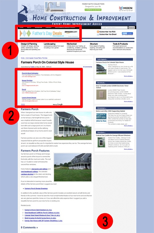
And here’s the after shot:
My Old Adsense Layout Included:
- 468 x 60 Text Only Unit located in the header area of my page.
- 468 x 60 Text Only Unit located between the post title and the body of the post.
- 468 x 60 Text Only Unit located at the end of the post before the comment section.
- Remove the old 468 x 60 Text Only Unit completely and replaced with an affiliate banner. The idea here is to remove some of the units in order to address concept #1 of Less is More.
- Replace the old 468 x 60 Text Only Unit with the 336 x 280 large rectangle unit. This unit is above the fold between the post title and body which makes it a very prominent position. This change addresses both of concept #2 and #3 for Size Matters and Position.
- Remove the old 468 x 60 Text Only Unit completely. I actually replaced this with the new Chitika Jumbo unit which is also performing quite well. Again the removal helps address the Less is More concept.
Immediate Results
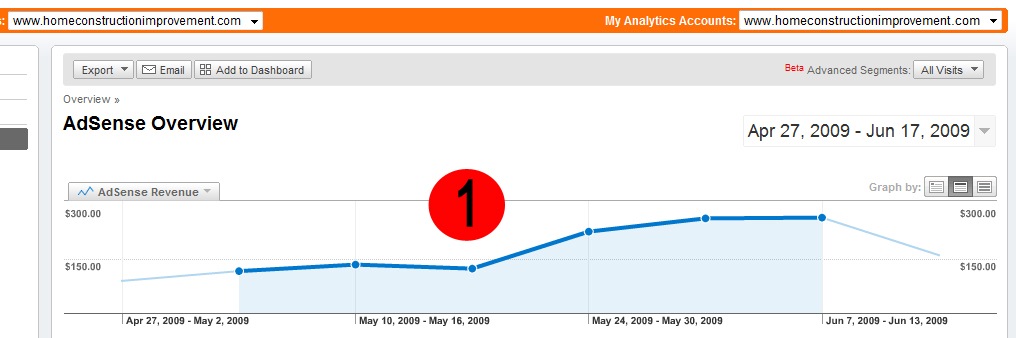
If you look at the graph of my Adsense revenue over the last two months you’ll see that the increased revenue was immediate. The changes were made as indicated by the Red Circle #1. As you can see my revenue went from under $150 per week to almost $300 per week. Immediate should be taken with a grain of salt, the increase happened over several days and it’s likely to take some time for Adsense to incorporate the reduced number of ads being served on your site.
No comments:
Post a Comment